Too many competing messages, dated styling, weak hierarchy, and no clear path for the distributor.

Before + after
See what changes
when the brand gets support.
These concept examples show how PromoSidekick can turn dated, disconnected marketing into a clearer and more persuasive supplier experience.
01
Email marketing
From cluttered blast to focused product story.
The improved version creates a strong visual hierarchy, makes the products the focus, uses one clear action, and brings the brand together from top to bottom.
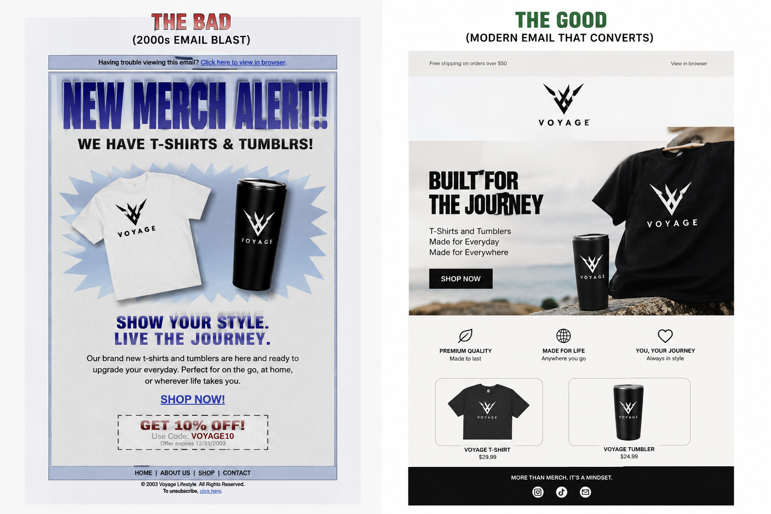
Message clarity, product presentation, brand consistency, mobile readability, and the call to action.
A campaign that feels credible, helps products stand out, and makes the next step easier to take.
02
Catalog design
From old-school pages to a modern selling tool.
The same products can feel completely different when the photography, hierarchy, specifications, and brand presentation finally work together.
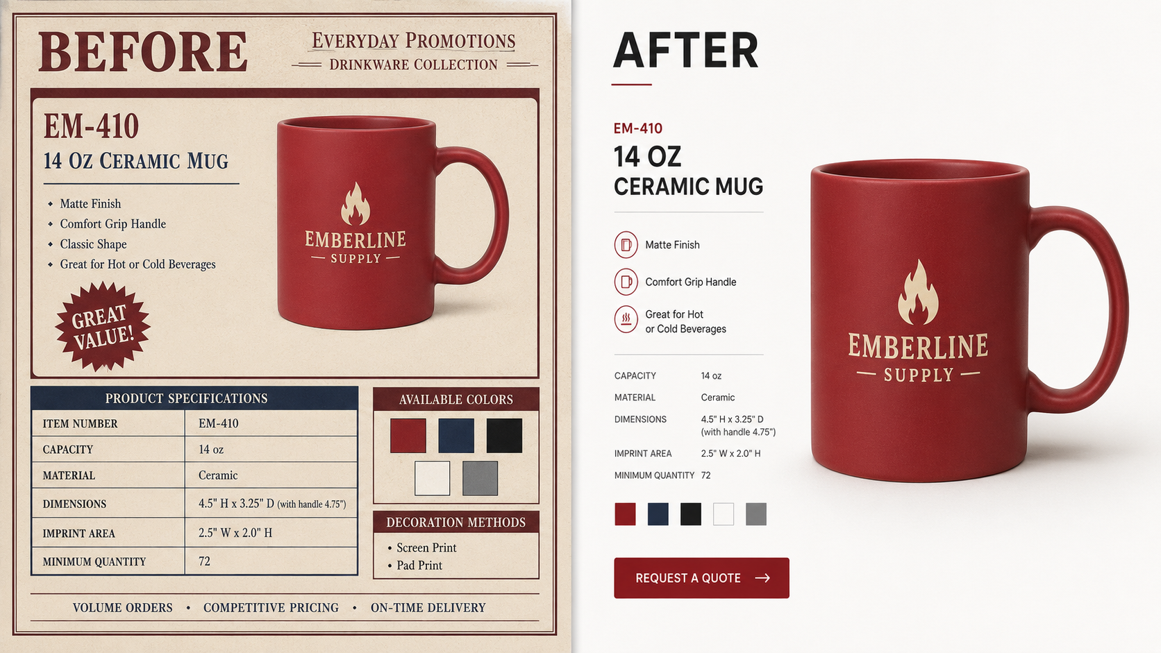
Crowded pages, weak photography, dated typography, and product information that is difficult to scan.
Product hierarchy, visual storytelling, specifications, brand styling, and distributor-friendly navigation.
The products stay the same, but the catalog becomes a confident, modern tool that is easier to sell from.
03
Logo refresh
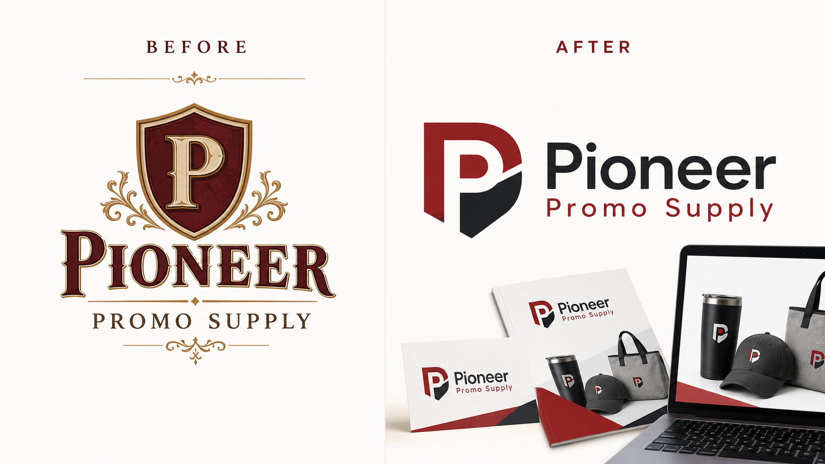
Keep the recognition. Lose the outdated look.
We identify what is worth preserving, simplify what is holding the identity back, and build a logo system that works everywhere.
04
Brand congruency
One supplier brand. Every touchpoint in sync.
A business card, website, catalog, campaign, flyer, and trade-show booth should feel like parts of the same company—not separate projects.
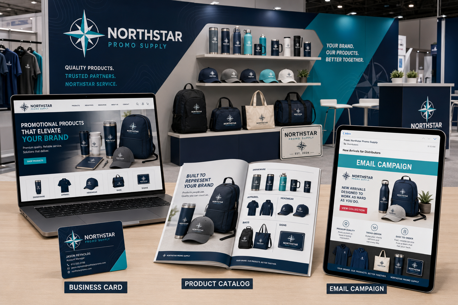
The logo, colors, typography, imagery, and tone stay recognizable wherever distributors meet the brand.
A connected system makes the supplier look established, organized, and ready to support distributor sales.
Reusable standards make future campaigns and materials faster to create and easier to approve.
What could work better?